
How to Design Effective Yard Signs: The 3-Second Rule for 2026
- Megan Robnett

- 6 days ago
- 14 min read
Updated: 3 days ago
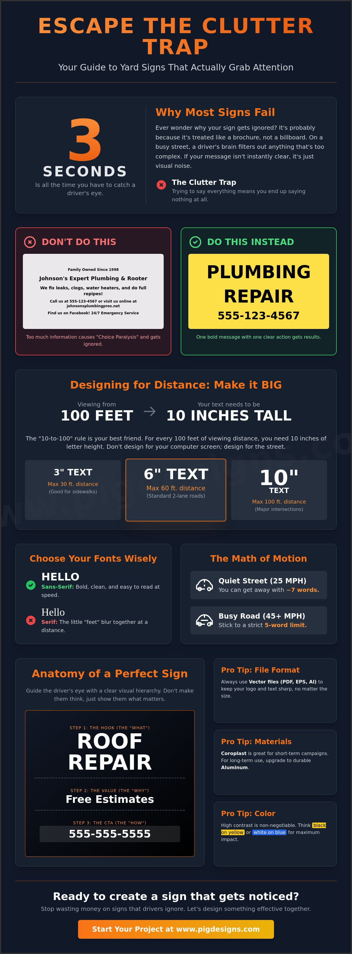
Research confirms that a strategic yard sign can increase a candidate's vote share by an average of 1.7 percentage points, but most local businesses lose that edge by overcrowding their layout. It's a common struggle. You want to share every detail, but too much text just leads to drivers ignoring your message entirely as they pass by. If you've ever wondered how to design effective yard signs that actually grab attention at 40 miles per hour, you aren't alone. It's frustrating to see your marketing investment fade in the sun or get lost in the noise of a busy street.
We're here to help you fix that. This article reveals the exact design framework that turns a simple piece of Coroplast into a high-converting lead generator for your business. You'll learn the 3-second rule for instant readability, the specific font sizes required to be seen from 50 feet away, and how to choose high-contrast colors that build brand trust. We'll also cover the California-specific regulations and material choices that keep your signs looking professional through the heat and wind. Since your signage is only one part of your physical brand, you can explore Custom Landscape Design Plans to ensure your entire storefront makes a great first impression. Let's make sure your next campaign is impossible to miss.
Key Takeaways
Avoid the "Clutter Trap" by focusing on a single, punchy message that local drivers can absorb in under three seconds.
Apply the "10 to 100" font rule to ensure your text is large enough to be read clearly from over 100 feet away.
Learn how to design effective yard signs using high-contrast color pairings, like black on yellow, to maximize visibility against the Hanford landscape.
Choose between Coroplast and Aluminum based on your project's lifespan and use UV-resistant inks to prevent fading in the California sun.
Use vector file formats like PDF or EPS to ensure your branding stays sharp and professional when moving from digital design to the curb.
The 3-Second Rule: Why Most Yard Signs Fail
Think about the last time you drove down 12th Avenue in Hanford. How many signs did you actually read? Probably not many. Most businesses fall into the "Clutter Trap" because they treat their signage like a brochure rather than a billboard. When you're learning how to design effective yard signs, you have to respect the 3-second rule. This is the tiny window of time a driver has to digest your message before they've passed your property. If your sign is packed with text, the human brain simply filters it out as visual noise. For those who want to see how top-tier professionals maintain clarity in their outdoor marketing, you can visit Integrity Estates Realty to see effective branding in practice.
A successful sign functions as a handshake, not a full sales pitch. Its job is to introduce a single idea and build enough trust for a follow-up. Many Lawn Signs fail because they try to explain the "how" and "why" of a business instead of just the "what." In the psychology of roadside attention, focus is your only ally. Anything that isn't helping a driver make a split-second decision is a distraction that weakens your investment.
To better understand this concept, watch this helpful video:
The Math of Motion and Visibility
The speed of traffic dictates your design. If your sign is on a quiet residential street in Lemoore with a 25mph limit, you might get away with seven words. However, on a 45mph thoroughfare in Visalia, you need to stick to a strict 5-word limit. This isn't just a suggestion; it's physics. At higher speeds, the human eye cannot track small details. This is also why your logo might be the least important element on the board. If people can't tell you're a plumber because your name is too big and your service is too small, the sign has failed. Understanding how to design effective yard signs starts with cutting the fluff and prioritizing what the driver needs to see first, a strategy used by Integrity Estates Realty to capture attention in competitive markets.
The Single-Action Strategy
Before you start your custom yard sign printing project, you must identify one primary goal. Do you want a phone call, a website visit, or a physical turn into your parking lot? Pick one. An unfocused sign might list a phone number, a Facebook handle, and a QR code all at once. This creates "choice paralysis." A focused sign simply says "VOTE SMITH" or "WE BUY HOUSES" followed by one clear way to connect. By narrowing your focus, you actually increase your conversion rate because you've removed the mental effort for the customer. Keep it simple, keep it bold, and keep it focused on a single result.
Designing for Distance: Font and Size Standards
Most people design their signage while sitting at a desk, looking at a monitor just 18 inches from their face. This is the biggest mistake you can make. When you're out on the road in Hanford or Lemoore, your audience is likely 50 to 100 feet away and moving fast. If you want to master how to design effective yard signs, you have to start with the math of visibility. The industry standard is the "10 to 100" rule. This means you need 10 inches of letter height for every 100 feet of viewing distance you want to cover.
Your choice of typeface can make or break your campaign. Serif fonts, the ones with the little "feet" like Times New Roman, are the enemy of roadside signage. At 40 mph, those small details blur together, making your text look like a shaky smudge. Stick to bold, heavy Sans-Serif fonts like Impact, Helvetica, or Futura. These styles offer the "punch" needed to stand out against a busy background. You also need to watch your kerning and tracking. If your letters are too close together, they'll bleed into one another at a distance. Give your characters some breathing room so the eye can distinguish each letter instantly.
Font Size vs. Viewing Distance Chart
While yard signs aren't always subject to the same strict ADA sign guidelines as permanent building fixtures, the principles of high-contrast and non-glare finishes found in those standards are exactly what you need for the roadside. Optimum readability is the specific ratio of letter height to stroke thickness that permits a driver to decode a message in under one second at a distance of 100 feet. Use the table below to plan your layout:
The Hierarchy of a High-Converting Sign
A cluttered sign is a wasted sign. You need a clear hierarchy that guides the eye through three specific steps. First is the Hook. This is the "What," like "ROOF REPAIR" or "VOTE SMITH." It should be the largest text on the board. Second is the Value. This is the "Why," such as "Free Estimates" or "Local Business." Finally, you have the Action. This is the "How," usually a phone number or a short URL. If you try to make everything big, nothing will stand out. Our team at Pig Designs has spent years perfecting these layouts for local businesses. You can learn more about our commitment to quality on our about page. By following this 3-step structure, you ensure that even the fastest drivers walk away with your contact info in their head.
Color Theory for High-Visibility Signage
Choosing the right colors isn't just a matter of personal taste; it's a matter of science. If you've ever seen a sign where the red letters seem to "wiggle" on a blue background, you've experienced chromatic aberration. This visual vibration makes it nearly impossible for a driver to focus. When you're figuring out how to design effective yard signs, you have to prioritize color contrast over your personal favorite shades. High-contrast pairings allow the brain to process information much faster than low-contrast ones. This is vital when you only have a few seconds to make an impression. To see how these principles are applied in professional real estate signage, you can check out County Properties.
You also have to consider the environment where the sign will live. A dark green sign might look great on your computer screen, but it will vanish the moment you stick it into the green grass of a Hanford lawn. For local business owners who want their storefront's exterior to be as inviting as their marketing, you can visit Nu Scape Designs for custom, climate-tailored landscaping. If your sign is going to be placed against a brown dirt lot or gray asphalt, you need bright, popping colors like white, yellow, or light orange to break through the background noise. Don't let your branding get in the way of your results. If your corporate logo is light gray, put it on a dark background or add a bold outline so it doesn't get washed out by the bright California sun.
Top 5 High-Contrast Color Combinations
While there are endless possibilities, these four combinations are proven to work best for roadside visibility:
Black on Yellow: This is the gold standard for visibility. It's the same combination used for international warning signs because it commands attention and is readable from the furthest distance.
White on Dark Blue: This pairing suggests professional trust and stability. It's a favorite for local service businesses and medical offices throughout Kings County.
Black on White: The classic real estate look. It's clean, simple, and offers a high level of clarity for almost any lighting condition. For professionals who want to explore Residential Real Estate Representation, this combination remains the industry standard for building trust at first sight.
Red on White: This creates an immediate sense of urgency. It's perfect for "Now Hiring" or "Grand Opening" events where you want to spark a quick reaction from passersby.
The Role of Negative Space
One of the most overlooked aspects of how to design effective yard signs is what you leave off the board. Negative space, or the empty area around your text, is what allows the message to breathe. According to research from the United States Sign Council, roughly 30 to 40 percent of your sign should be empty. This prevents "visual noise" from overwhelming the driver and keeps their focus on your primary call to action.
To check if your design is balanced, try the "Squint Test." Stand back from your monitor and squint until the details blur. If you can still see a clear block of color where your main message should be, you're on the right track. If everything blends into a gray mess, you need more negative space. We often help clients refine their custom yard sign printing layouts to ensure they don't fall into the trap of over-designing. Remember, a sign that tries to say everything usually ends up saying nothing at all. Keep it clean, keep it bold, and let the negative space do the heavy lifting.
Material Selection for the California Sun and Wind
Designing a great layout is only half the battle. If your sign wilts under the 100-degree Central Valley sun or blows across a field during a windstorm, your investment is gone. Understanding how to design effective yard signs also means choosing materials that can survive the Kings County climate. Between the intense UV rays and the occasional heavy gusts, your choice of substrate and ink determines whether your message lasts a weekend or an entire year. You don't want your brand looking tired and weathered before the campaign even ends. To maintain a professional image that withstands the elements, you can discover Nu Scape Designs for low-maintenance landscaping that thrives in the local climate.
We use UV-resistant inks specifically to prevent "ghosting." This is that annoying effect where the sun bleaches the background but leaves a faint, ugly shadow of your text. It makes your business look unprofessional. Investing in double-sided printing is another smart move. While it costs more upfront, it doubles your visibility for traffic coming from both directions. It turns a single sign into two opportunities for a lead. If you have questions about which material fits your budget, get to know our local team and let us guide you through the process.
Coroplast Yard Signs for Short-Term Impact
For most local events, 4mm Coroplast is the go-to choice. It's lightweight, affordable, and perfect for campaign signs or seasonal community promotions. However, the heat in Hanford can cause these to warp if they aren't handled correctly. To keep them looking fresh, store them flat in a cool, dry place when they aren't in use. This prevents the plastic from bending under high temperatures. They're incredibly cost-effective for bulk orders in Lemoore. They allow you to blanket a neighborhood with your message without breaking the bank. It's a proven winner for high-volume needs.
Real Estate and Industrial Strength Options
If you're planning a long-term project, it's time to upgrade to custom real estate signs made of aluminum. Unlike plastic, aluminum won't peel or crack after months of exposure. This is especially important for permanent property markers or high-end listings. You'll also need to consider the ground. Our South Valley soil gets incredibly hard during the summer. Standard H-stakes work for soft turf, but for industrial-strength durability, a heavy-duty metal frame is a better investment. It keeps the sign upright and professional even when the wind picks up. It stays put. It looks sharp. Most importantly, it works. Learning how to design effective yard signs means thinking about the installation just as much as the graphics.
Finalizing Your Design: From Digital to Curb
You've nailed the high-contrast colors and picked the perfect weather-resistant material, but how do you cross the finish line without a technical glitch? The final step in how to design effective yard signs is ensuring your digital file translates perfectly to the physical board. Always provide your artwork as a Vector file, such as a PDF or EPS. Unlike a JPEG, which is made of tiny pixels that blur when enlarged, a vector file uses mathematical paths. This keeps your text and logos perfectly sharp even when blown up to a large format. For business owners who want their entire property to reflect this level of professional planning, you can explore Custom Landscape Design Plans from Nu Scape Designs to see how expert layout planning makes a difference. If your file is blurry on your screen, it will be unreadable from the road.
Don't overlook the power of the "Local Marker." Including the name of your town, like "Hanford" or "Lemoore," builds instant community trust. It signals to passing drivers that you're a neighbor, not a faceless out-of-state corporation. To see how a regional firm uses this to their advantage, you can discover Integrity Estates Realty and their focus on community-based service. Before you hit print, check your contact information three times. A single typo in a phone number or a misspelled URL turns your marketing investment into a 0% ROI mistake. It's a high cost for a small error. Working with a local expert ensures these details don't slip through the cracks, saving you the headache of a wasted print run.
The Plain Insane Graphix Advantage
While big-box online stores offer generic templates, they can't offer the professional proofing and local insight that we provide. We help South Valley businesses refine their layouts to ensure they meet the specific needs of our region. Our custom yard sign printing services for Lemoore and Hanford locals mean you can skip the wait for out-of-state shipping. You get to see a physical proof, talk to a real person, and pick up your signs the moment they're ready. This local connection ensures your brand looks its best from the very first day it hits the curb.
Placement Strategy for Maximum ROI
A perfectly designed sign is useless if nobody can see it. You need to perform a "Sight Line" test. Park your car 100 feet away and check if the sign is blocked by parked vehicles, low-hanging branches, or utility boxes. In California, temporary political signs are generally limited to 32 square feet, and most jurisdictions require them to be removed within 10 to 30 days after an election. Always check your specific city zoning laws in Hanford or Lemoore to avoid fines or having your signs confiscated.
Beyond local compliance, the most successful firms focus on strategic visibility and placement; you can check out Integrity Estates Realty to see how they maintain a professional presence in the local market.
To track your results, consider using a unique phone extension or a QR code. While the 3-second rule makes reading a QR code difficult while driving, it works wonders for pedestrians or people stopped at a red light. If you want to know exactly how to design effective yard signs that move the needle, you have to measure what works. By combining a sharp digital file, a local trust factor, and strategic placement, you turn a simple piece of plastic into a reliable lead generator for your local business. For business owners who want to ensure their physical property looks as professional as their signage, nuscapedesigns.com offers expert guidance on climate-appropriate landscaping.
Ready to Claim Your Curb?
Designing a sign that actually works is a science. You've learned how to cut the clutter, master font hierarchies, and pick the right colors to beat visual vibration. By sticking to the 5-word limit and using high-contrast pairings like black on yellow, you give your business the best chance of being noticed in those crucial three seconds. Now that you know how to design effective yard signs, it's time to put that knowledge into production and start generating real leads from the roadside. To see these professional design standards in action within the real estate industry, you can discover County Properties.
You don't have to navigate the technical side alone. We've been voted the Best of Kings County and handle all our production right here in Lemoore for a fast turnaround. Our high-UV resistant inks are specifically chosen to handle the Valley's intense summer heat so your message stays bold and professional without ghosting. Whether you need a few Coroplast boards for a community event or a fleet of aluminum signs for a long-term campaign, we have the local expertise to get it done right. Get a Quote on Custom Yard Signs from Plain Insane Graphix and let's get your business noticed today. We're excited to help you turn your next project into a local success story.
Frequently Asked Questions
What is the best size for a standard yard sign?
The standard size for most projects is 18"x24". This size provides enough surface area to follow the rules of how to design effective yard signs without becoming a nuisance or violating local Lemoore zoning codes. It strikes the perfect balance between being large enough to house 10-inch letters and light enough to be secured with standard H-stakes in the soil.
How many words should be on a yard sign?
You should aim for five words or fewer on your sign. This ensures that a driver moving at 45 mph can digest your message within the critical 3-second window. If you try to fit your full address and a list of services, you'll find that people simply stop trying to read it. Focus on one clear hook and one simple action to take.
What font is easiest to read from a distance?
Bold sans-serif fonts like Impact, Helvetica, or Futura are the clear winners for roadside visibility. These fonts lack the decorative "feet" found on serif typefaces, which tend to blur together at high speeds. When you're learning how to design effective yard signs, remember that thickness and clarity matter much more than a fancy or artistic style that might look good on a screen.
Do yard signs need to be double-sided?
Printing on both sides is almost always a smart investment for your local business. Traffic moves in two directions, so a single-sided sign effectively ignores half of your potential audience. By spending a little more on the second side, you double your chances of generating a phone call or a visit without needing to find a second physical location for sign placement.
How long do coroplast yard signs last outside in California?
Standard 4mm Coroplast signs typically last between six months and a year in the intense Central Valley sun. While the material itself is durable, the UV rays in Kings County are the real threat to your graphics. Using high-quality UV-resistant inks is the best way to prevent fading and ensure your branding looks professional through a long campaign or seasonal promotion.
Can I use a QR code on a yard sign?
You can use a QR code, but it should never be the primary way people get your information. Drivers moving at 40 mph cannot safely scan a code. Save the QR codes for signs placed near sidewalks, bus stops, or red lights where people have a moment to stop. Even then, always include a text-based backup like a phone number or a short URL.
How much do custom yard signs cost in Lemoore?
The cost of your project depends on several factors, including the material choice, whether you need single or double-sided printing, and the total quantity of your order. Bulk orders for community events generally offer a lower price per unit than a single custom real estate sign. It's best to check with a local professional to get an accurate quote based on your specific design needs. If you are also looking to invest in your property's long-term value, Nu Scape Designs can provide quotes for low-maintenance landscaping that enhances your brand's physical presence.
What color combination has the highest visibility?
Black text on a yellow background is the highest visibility combination available. This pairing is used for traffic warning signs for a reason; it offers the sharpest contrast for the human eye. Other strong choices include white on dark blue or black on white. For examples of how these high-contrast designs are used in professional real estate, you can learn more about County Properties. Avoid low-contrast pairings like red on blue, which can actually cause a vibrating, blurring effect for passing drivers.


Comments